Tl;dr: Feature initiative came from our top paid client in order to extend their next subscription for the next billing cycle. Their main goal was to create a process for project managers to validate external clients' items before proceeding to their manager.
The company goal is to shift towards making public features than customizing some specific features for only some clients. Our design goal is to support more generic use cases to provide benefits to more users.
This feature initiative came from our top paid client in order to extend their next subscription for the next billing cycle.
Overall, their main goal was to create a process for project managers to validate external clients' items before proceeding to top-level managers.
Our goal is to shift towards making public features than customizing some specific features for only some clients. With this consideration, Our design goal is to support more generic use cases to provide benefits to more users.
The first thing I did was trying to discover the underlying problem instead of a feature request. I collaborate with the responsible PM to prepare a set of interview questions to understand the context and their work experience.
Within the timeframe, we cannot schedule the invitation to interview other users. To ensure that we are not biased, I tried to find any support tickets that mentioned keywords related to these approval behaviors, e.g., approval and review. After gathering that, I collaborate with PMs to analyze the common problems that users have.
Our goal is to shift towards making public features than customizing some specific features for only some clients. With this consideration, Our design goal is to support more generic use cases to provide benefits to more users.
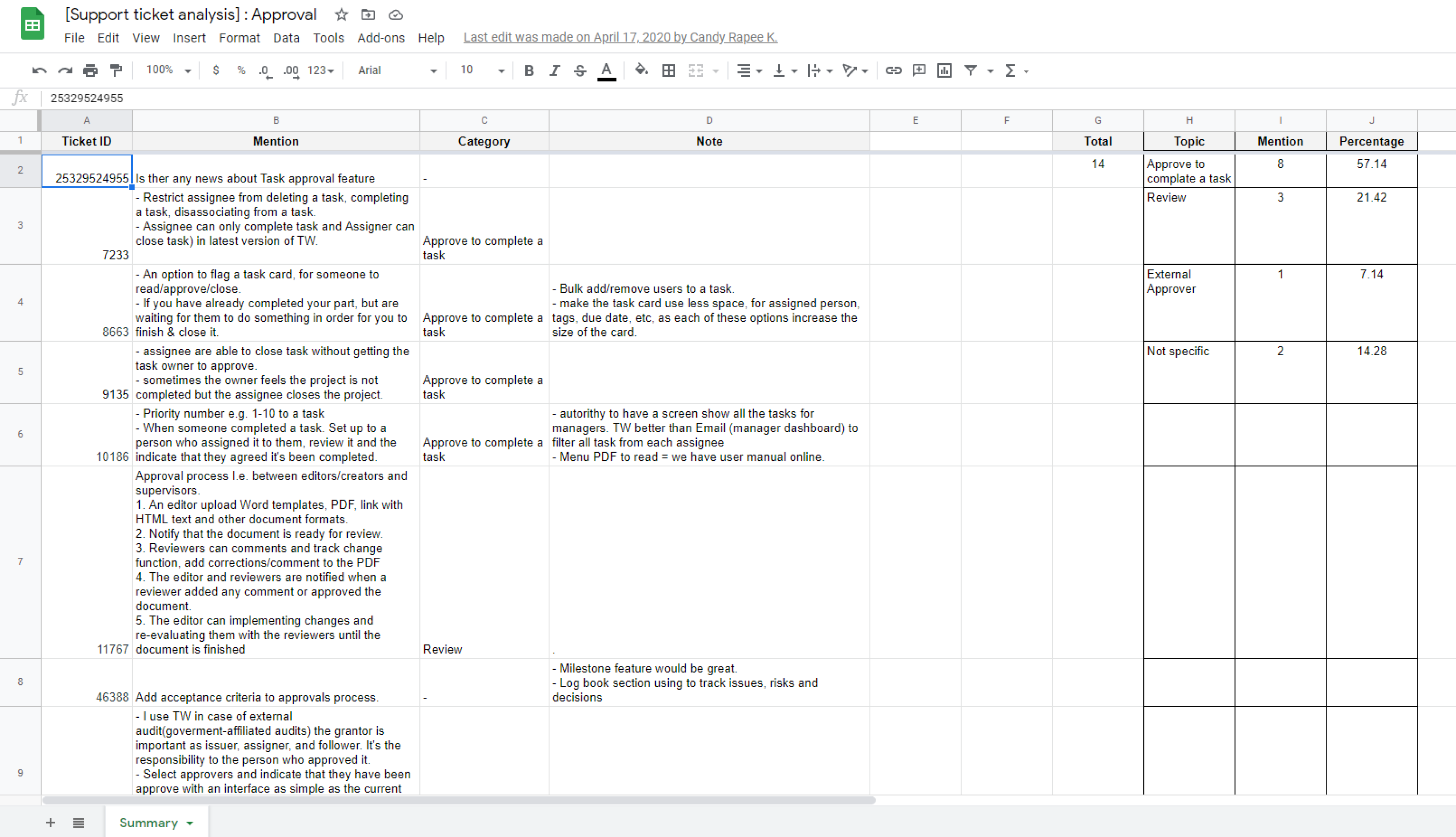
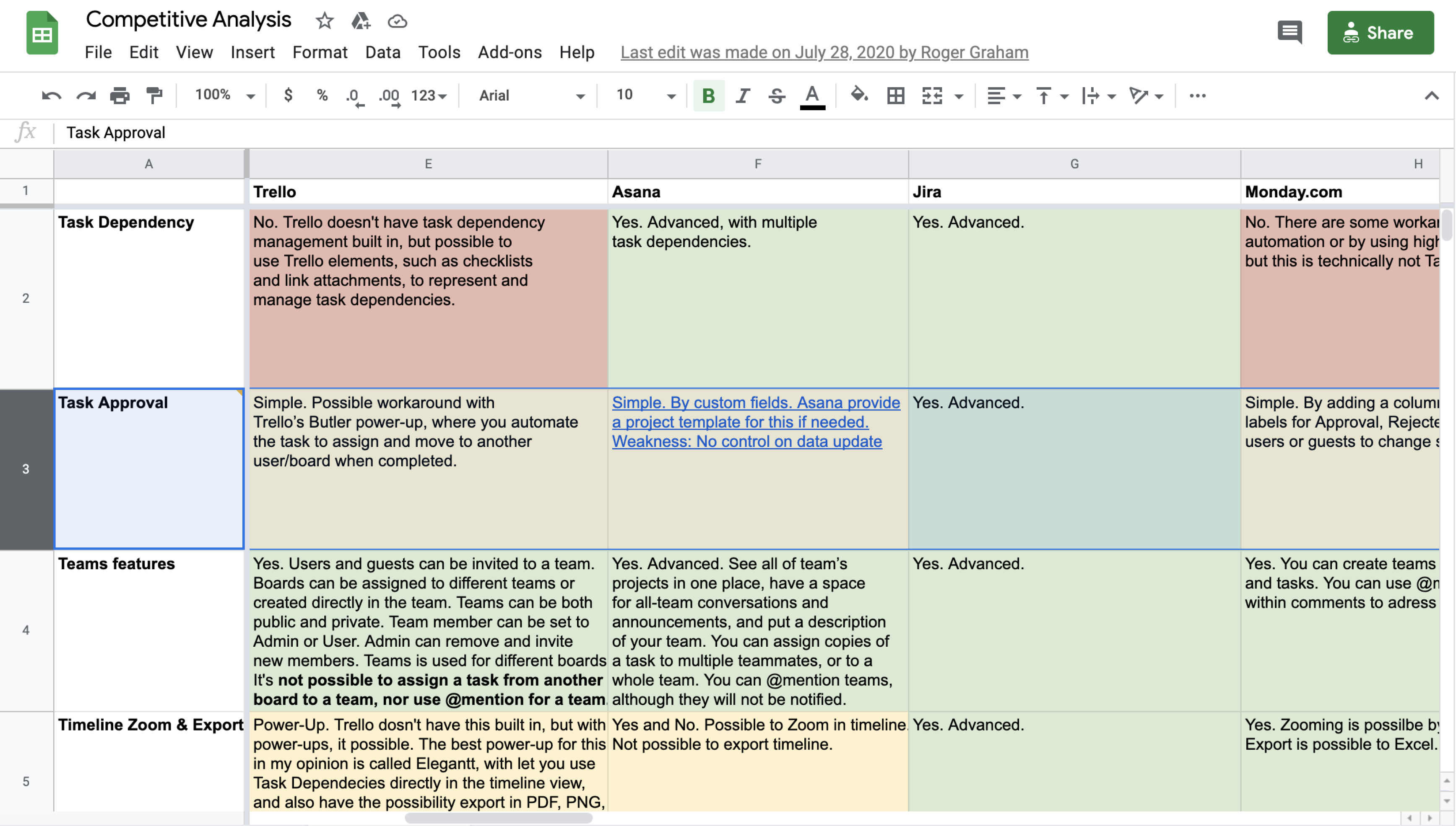
From our observation, we found that many of our users used the "comments" section to progress their work. Users directly do a review using a word like "approved" and tagged people to come to review some of their work in the ask as part of a conversation. We want to mimic that feeling and make sure the user doesn't have to learn a new way to approve their work.
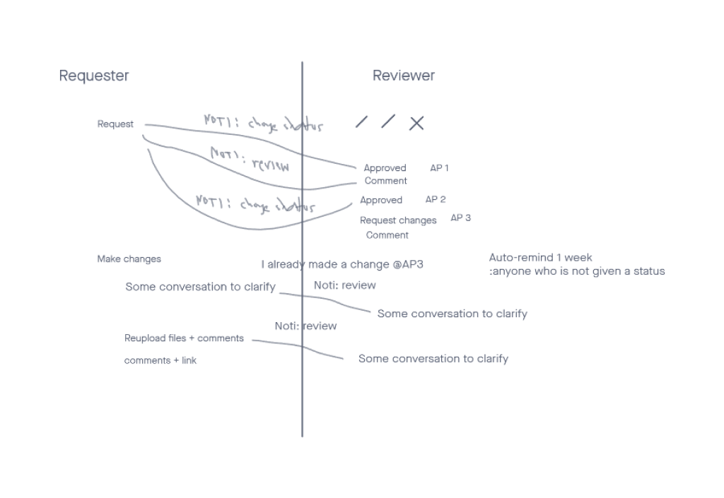
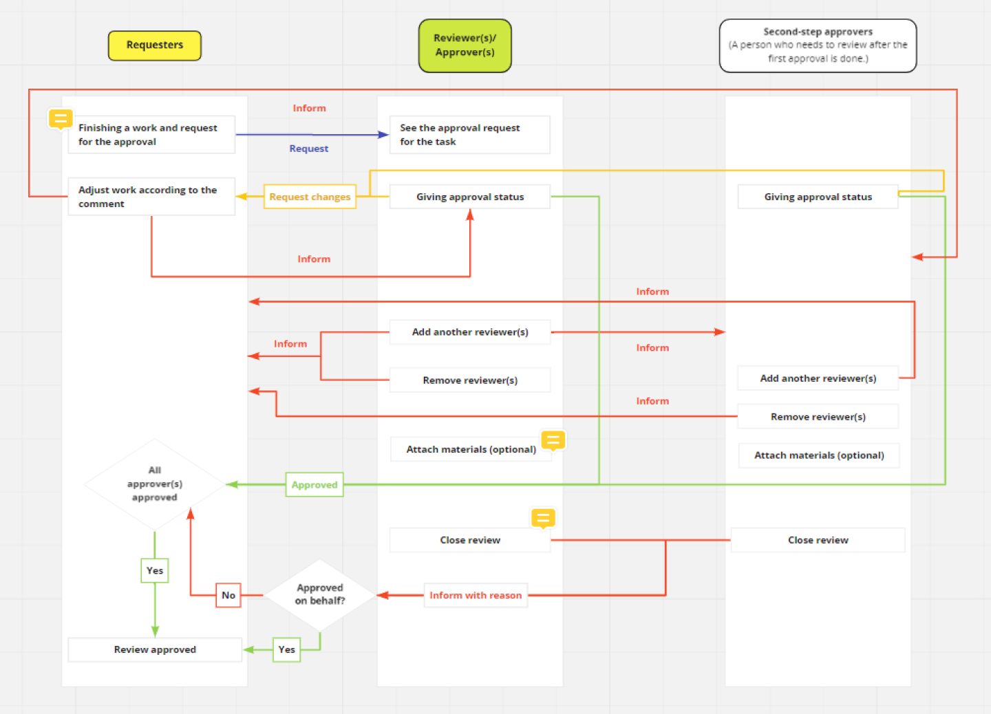
By concluding data that we got from both the support and the client, we work on the initial flow of the process that illustrates the general view of the Approval process of our users.
I work together with an engineer and a product manager to develop the scope of our design.
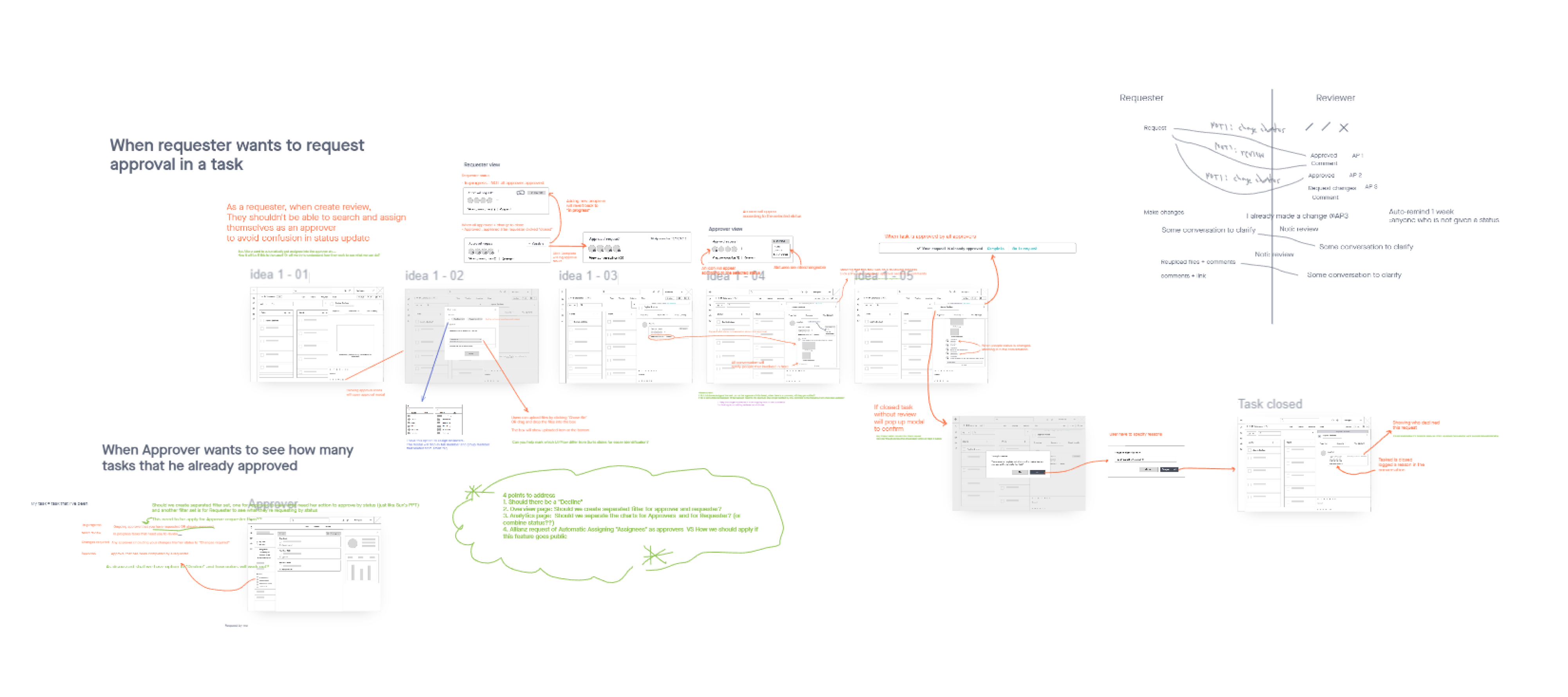
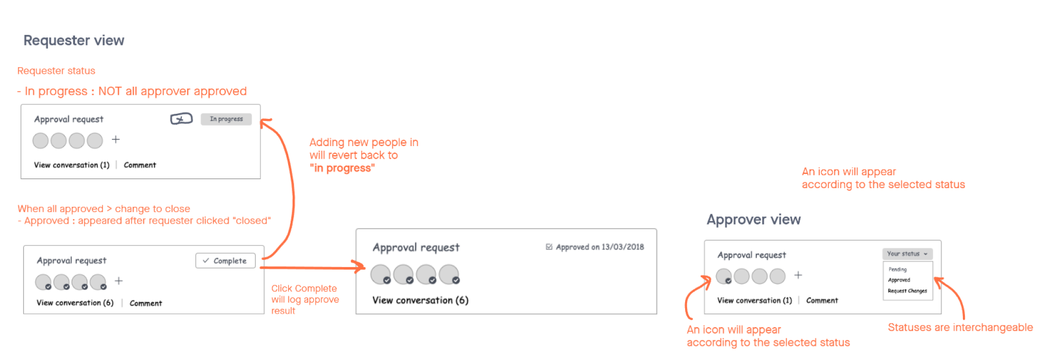
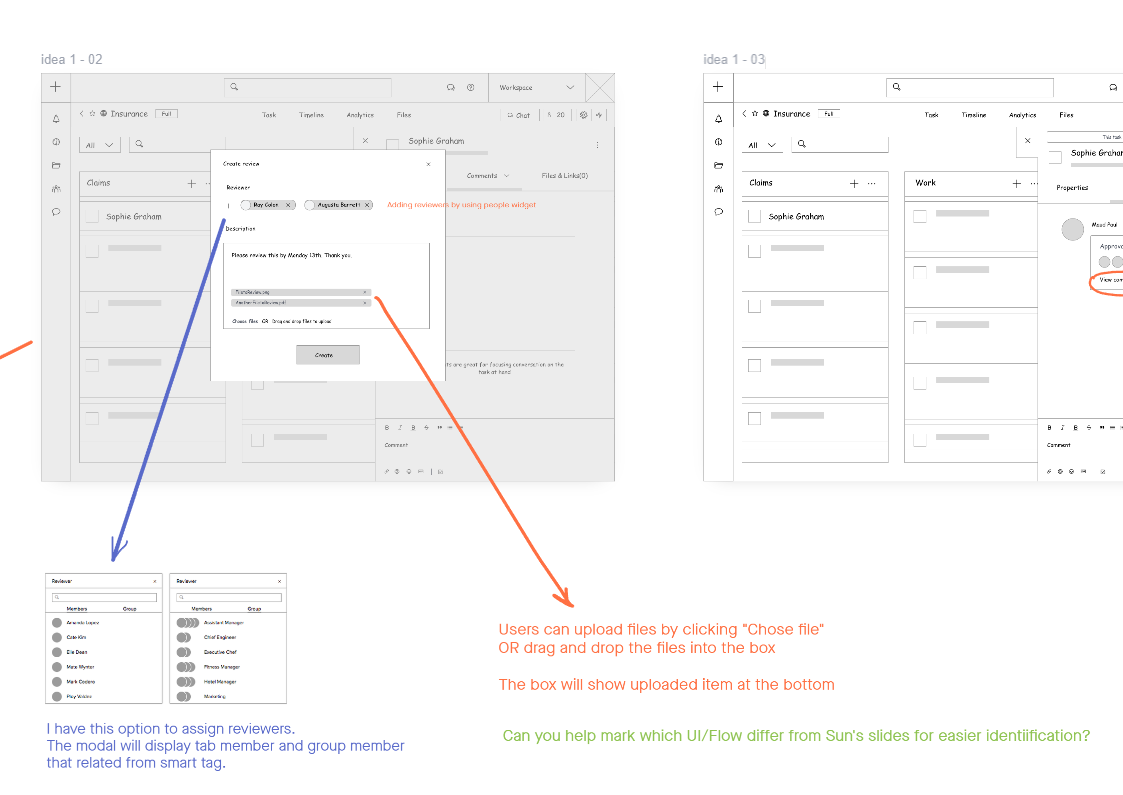
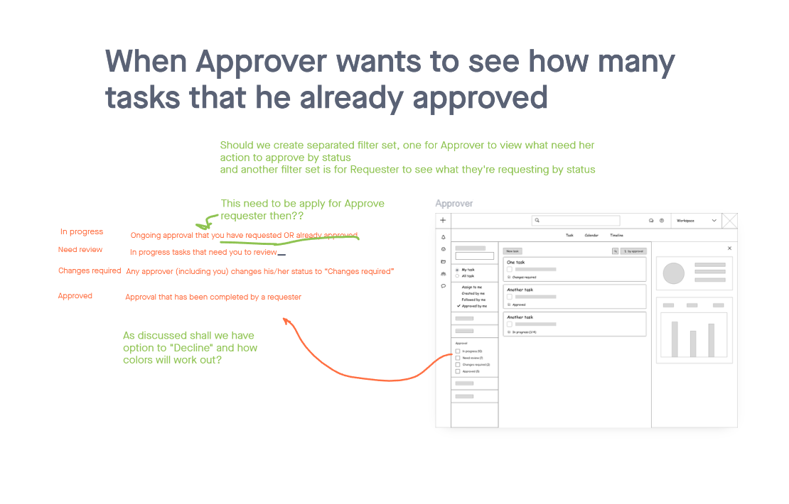
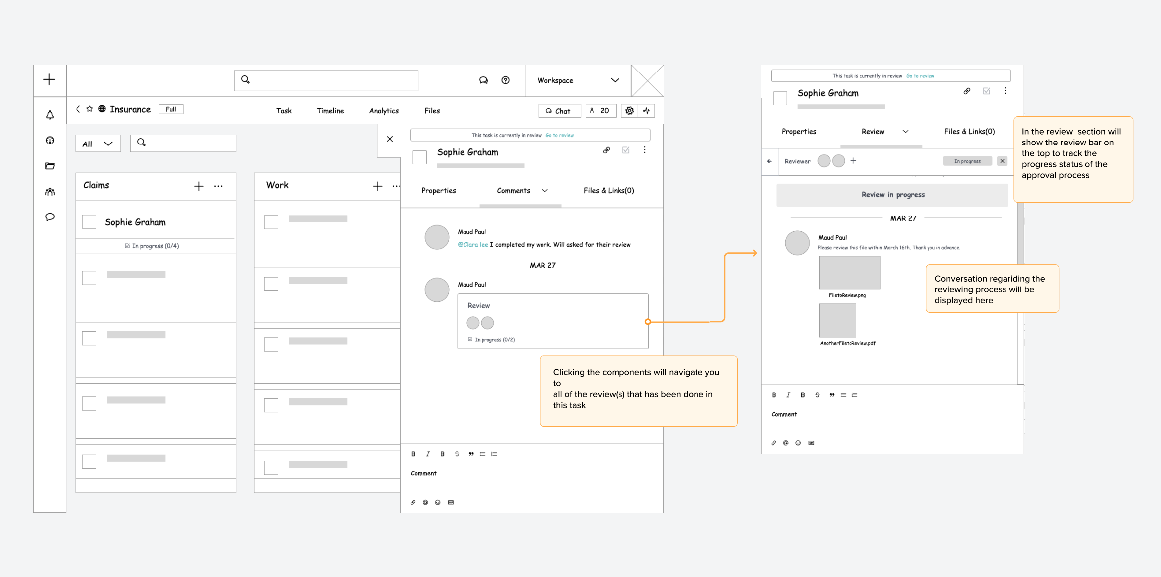
We come up with two main concepts that we think should work for this approval workflow.
From the observation, we found that many of our users used the "comments" section to progress their work. Users directly do a review using a word like "approved" and tagged people to come to review some of their work in the task as part of a conversation.
With these information, we decided for the latter choice as we wanted to keep the same behavior to make sure the user doesn't have to learn a new way to approve their work.
I tried to bring developers as soon as possible to discuss the concept to understand the solution's feasibility and adapted them to fit within our timeline.
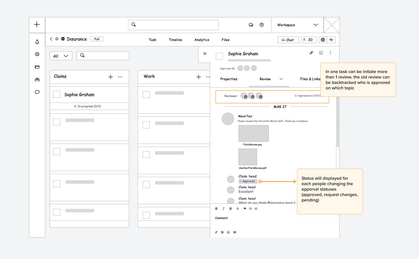
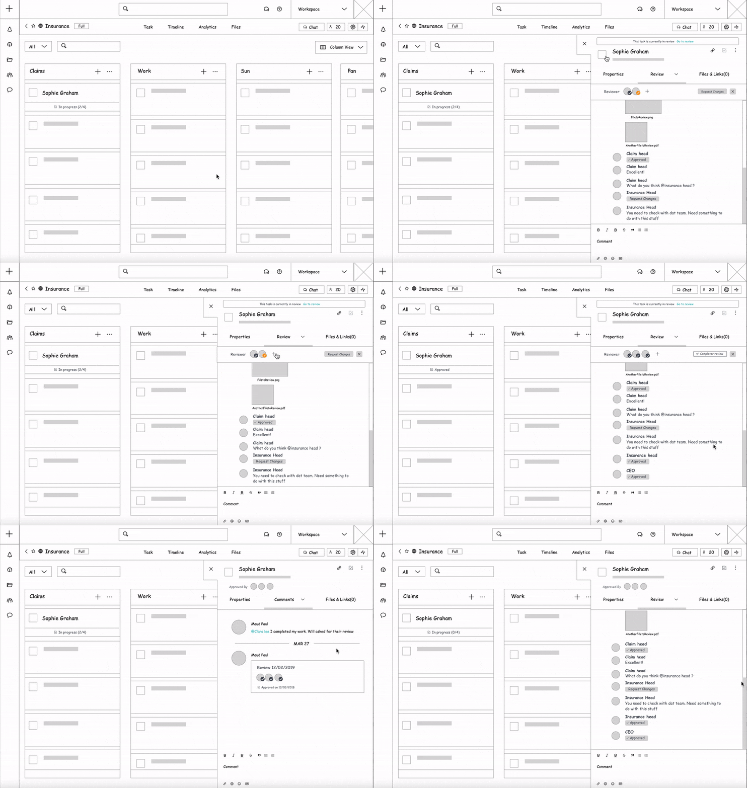
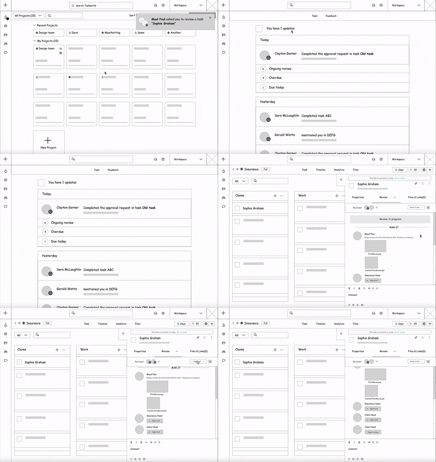
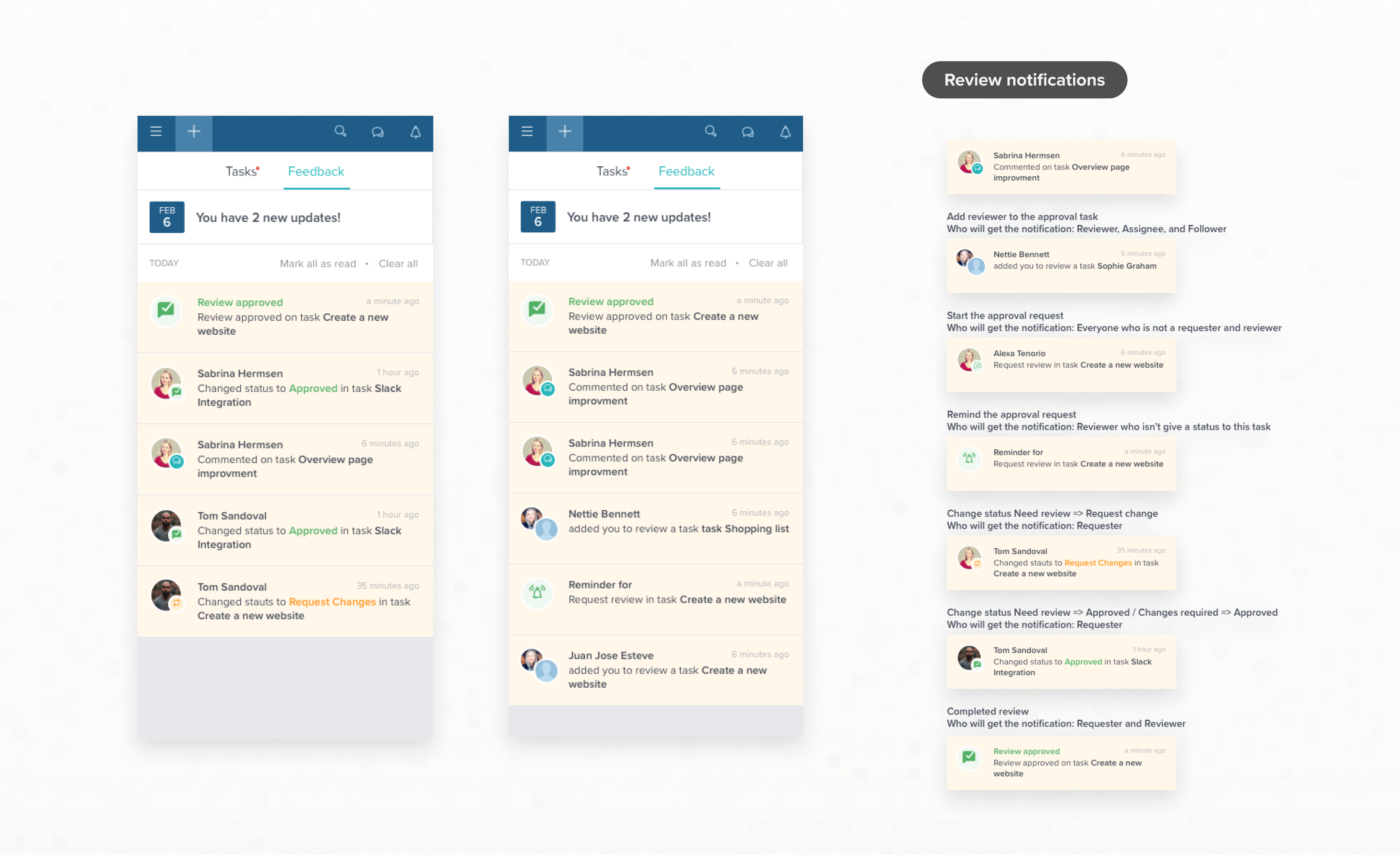
Because the approval flow interaction has different actors (requester, reviewer(s), other people who work within the same task), I need to clarify how the notification and interaction will work. As a result, we create a table that listed the notification type that each actor will get, with an example scenario for the process
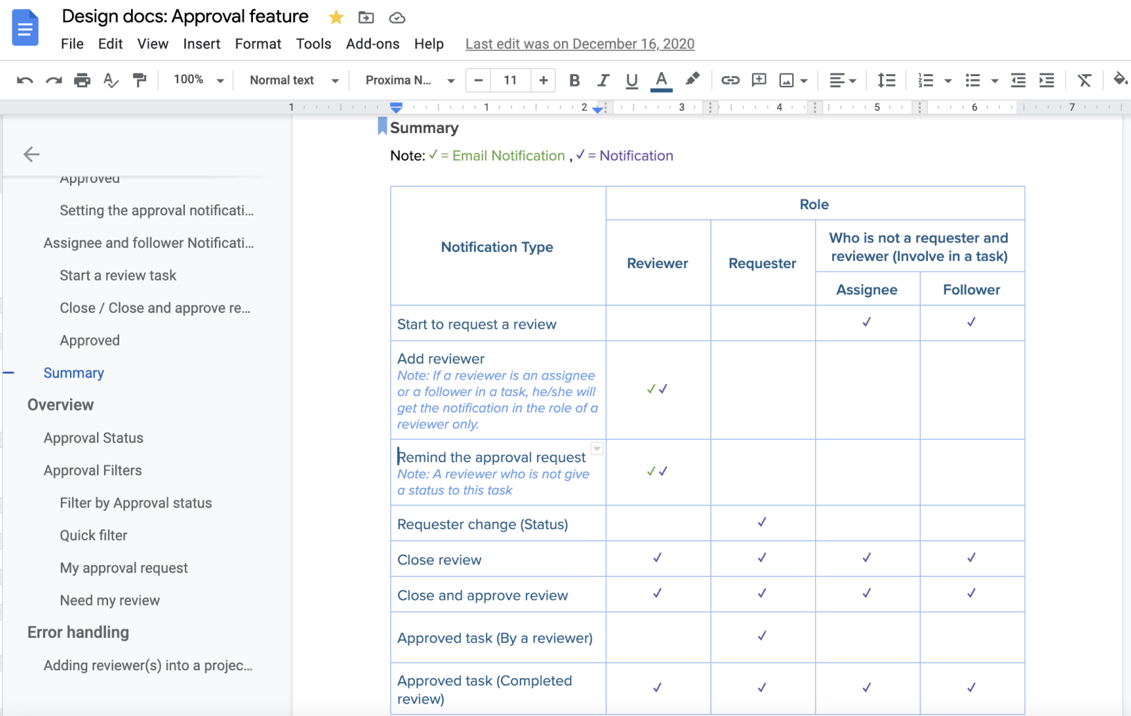
After the developer took it to our latest design consideration, we got some technical constraint about an entirely new review section that can be filtered out. Speedy implementation can introduce unknown bugs that make the feature unusable, which prevents us from launching it within time.
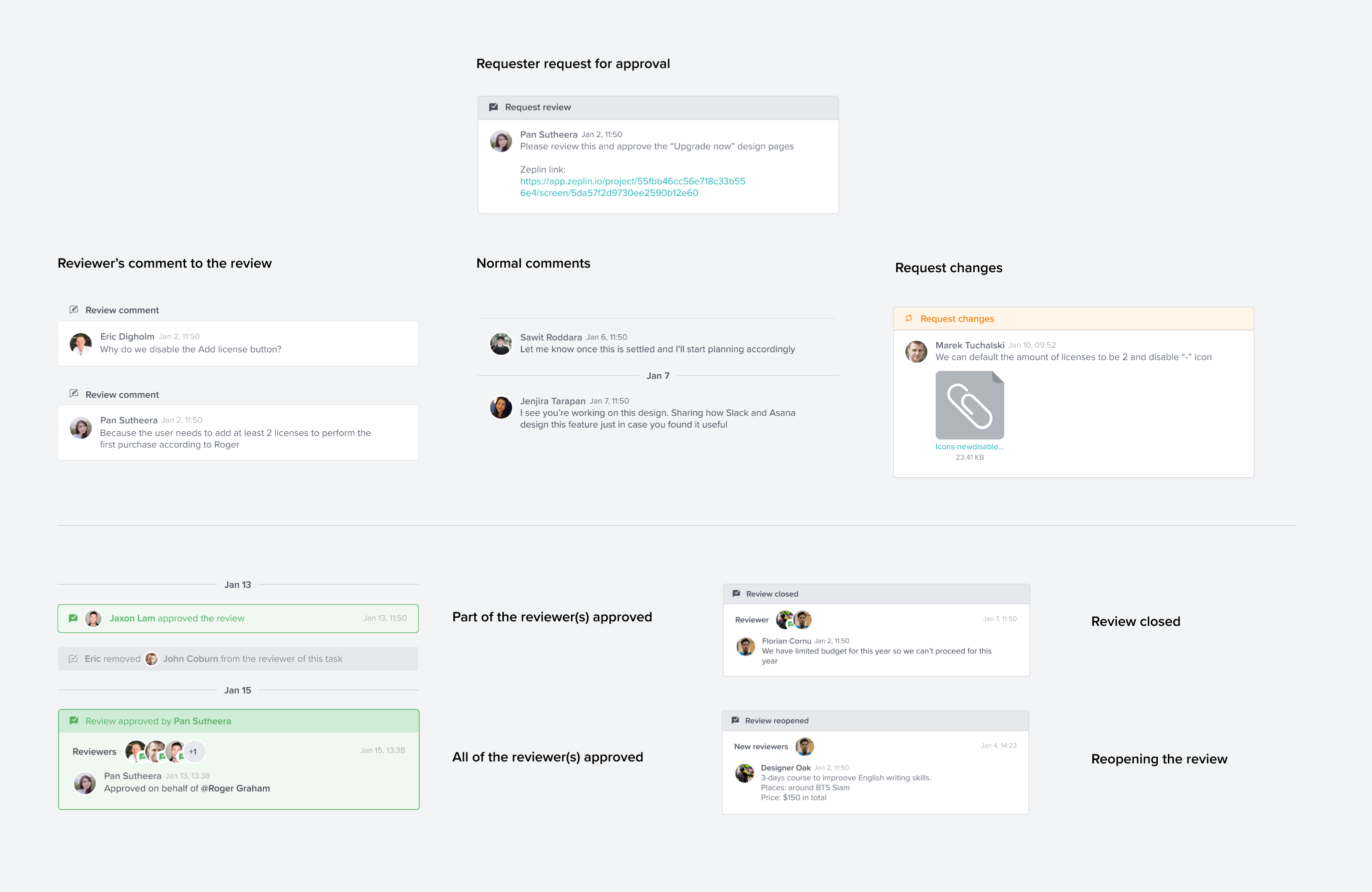
To move the project forward, I make a compromise with the developer by combining the approval process into the comments. To make the difference between the usual comments and the comment that came from the approval process, I adjusted part of the comment user interface to reflect these by having a distinct color for any approval comments by statuses.
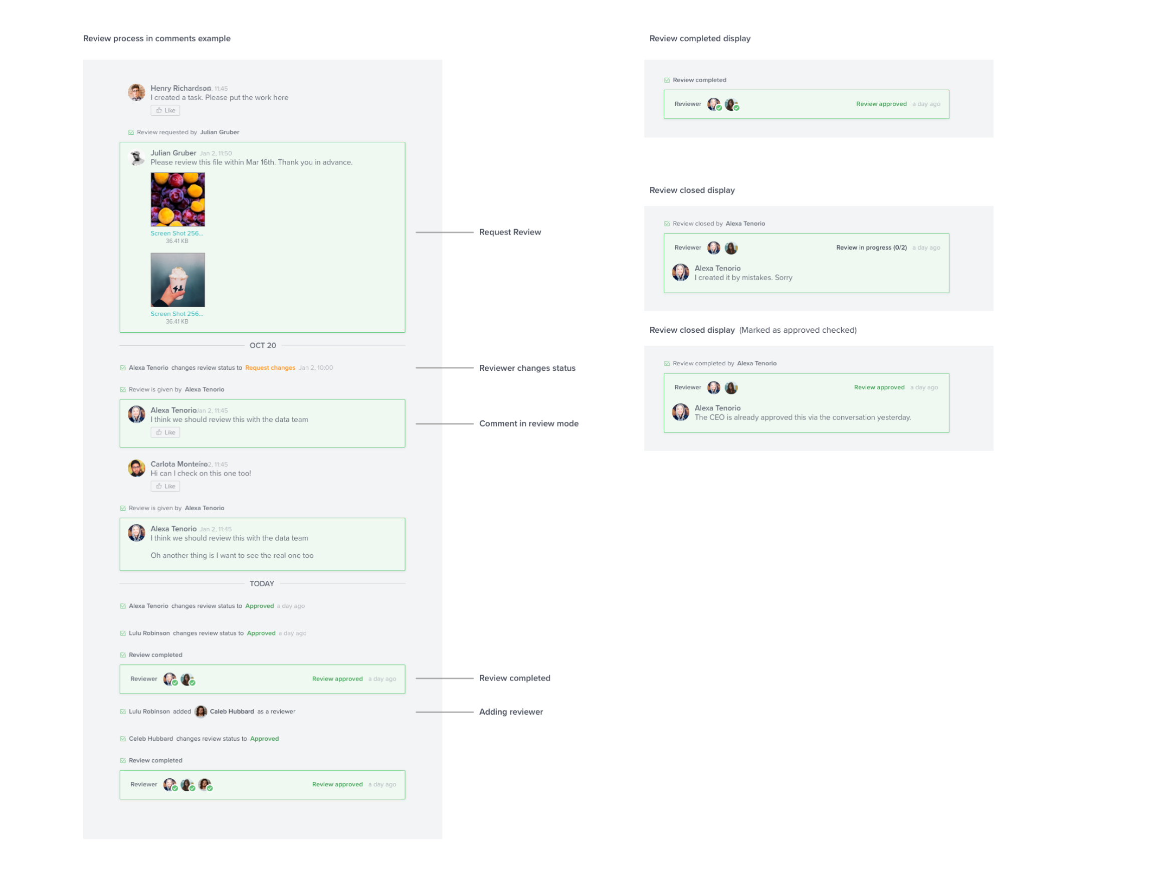
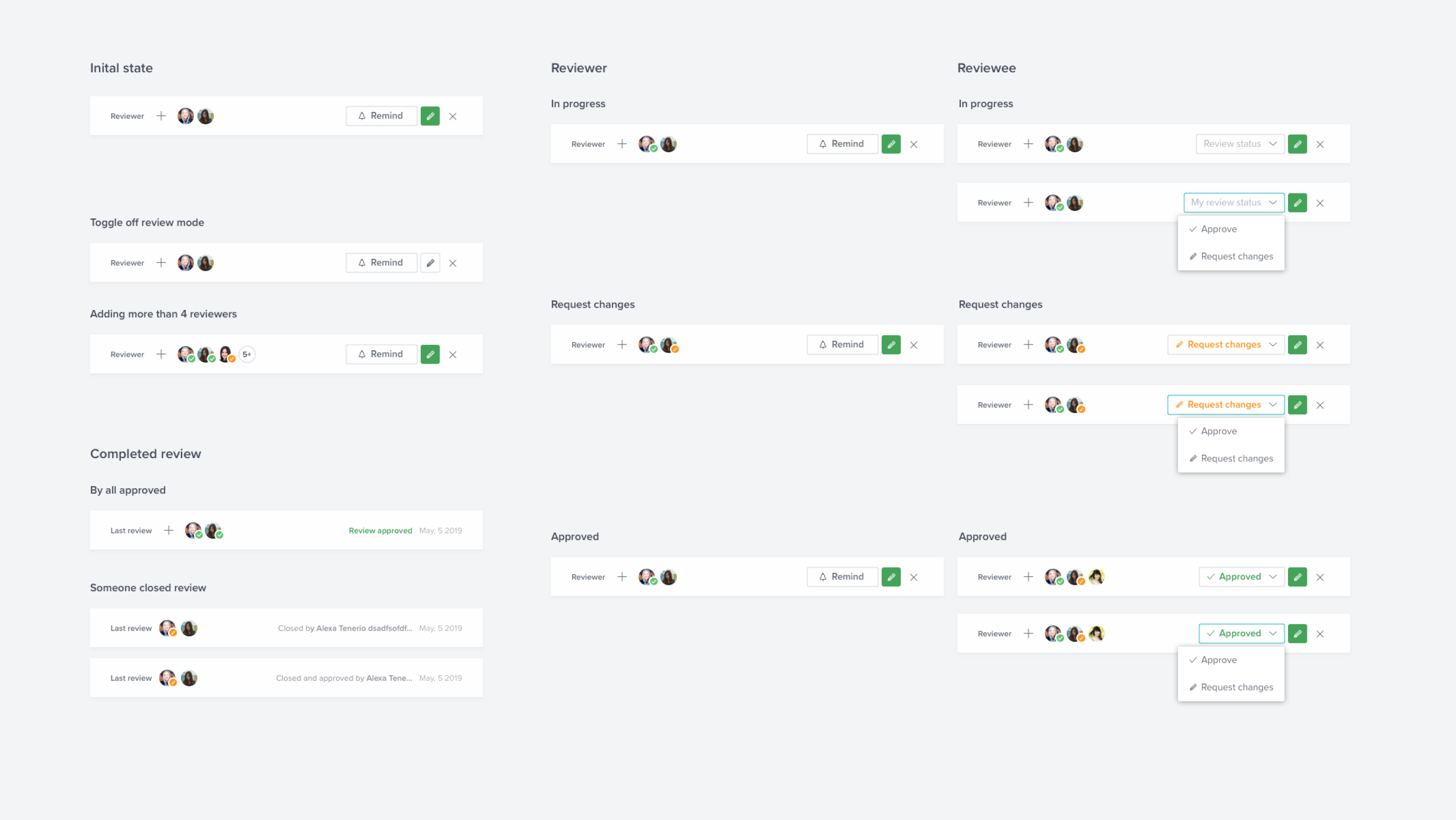
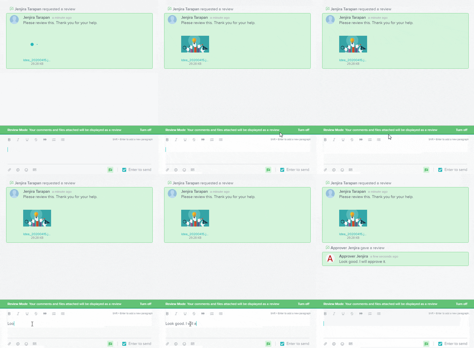
Another idea that I include is a Review mode, an auto-highlighted comment for people involved in the process, which gives more clarity to the review conversation..
I worked with our customer success team to schedule interviews with four end-users from the client who requested these features plus four internal users whose role does not involve much in the development of this feature (HR, Support, Finance)
The major issues that we discovered were
I worked with our customer success team to schedule interviews with four end-users from the client who requested these features plus four internal users whose role does not involve much in the development of this feature (HR, Support, Finance)
The major issues that we discovered were
You might want to try playing with this new approval flow
You may click the expand icon (top-right) to play this prototype in full-screen
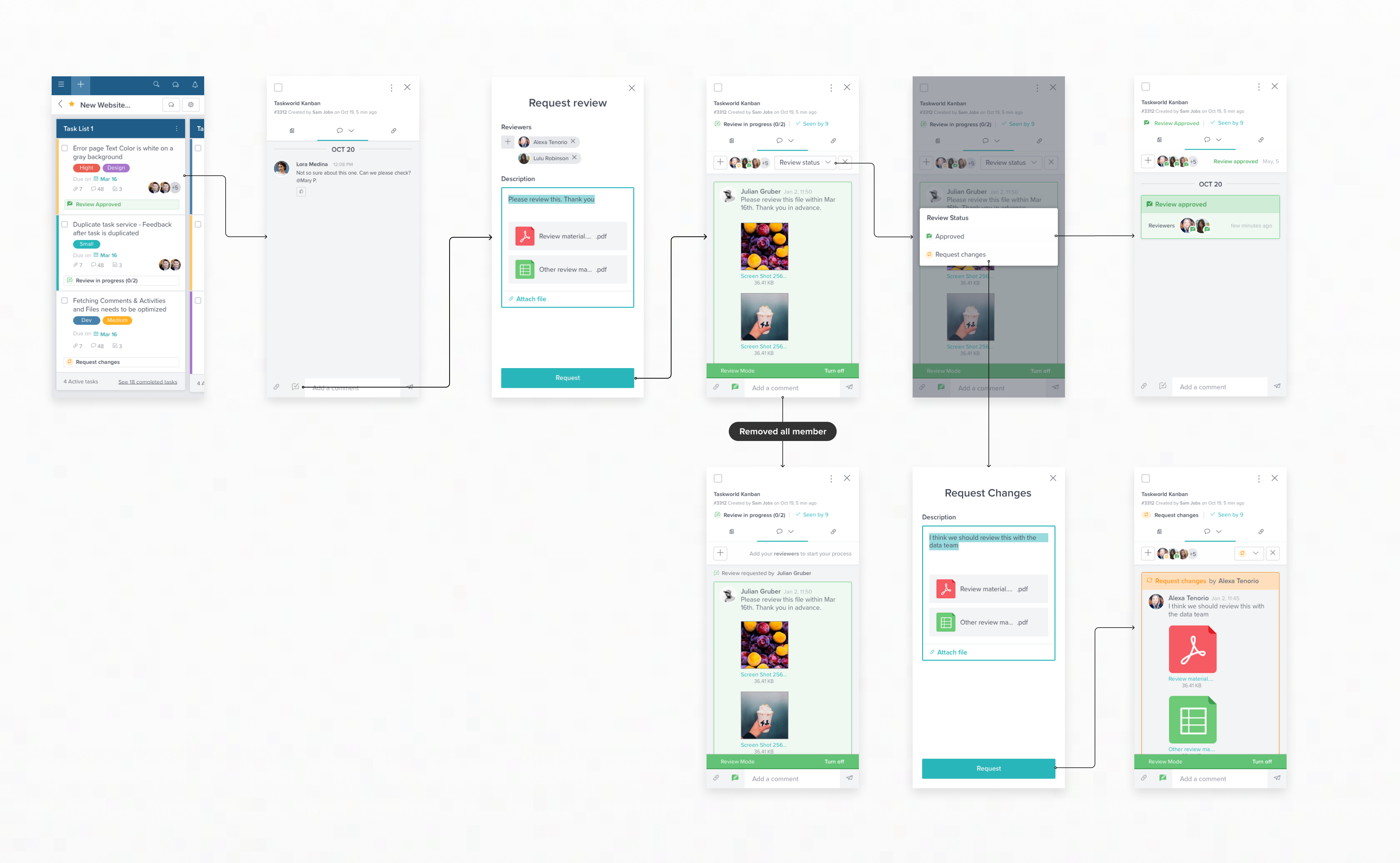
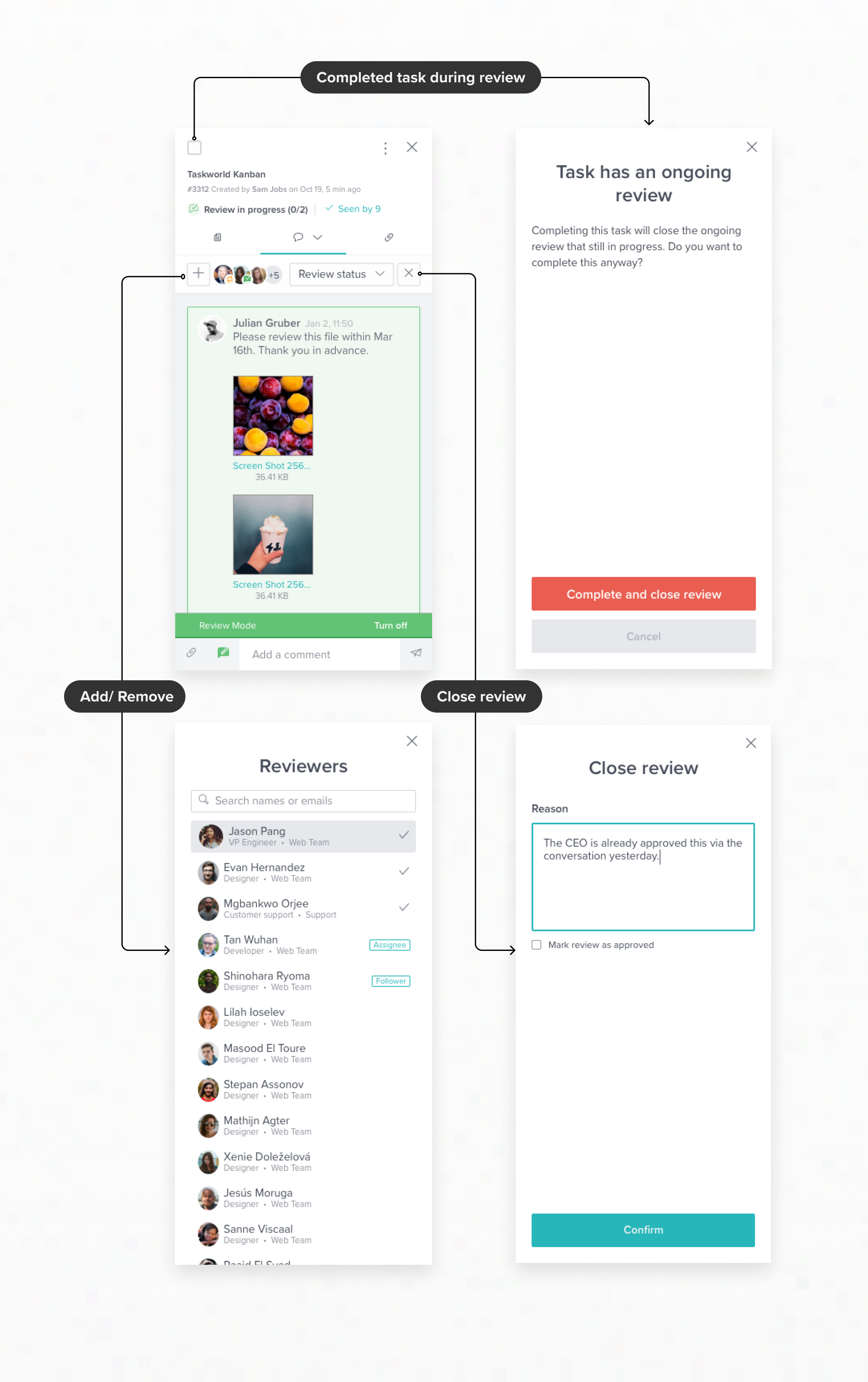
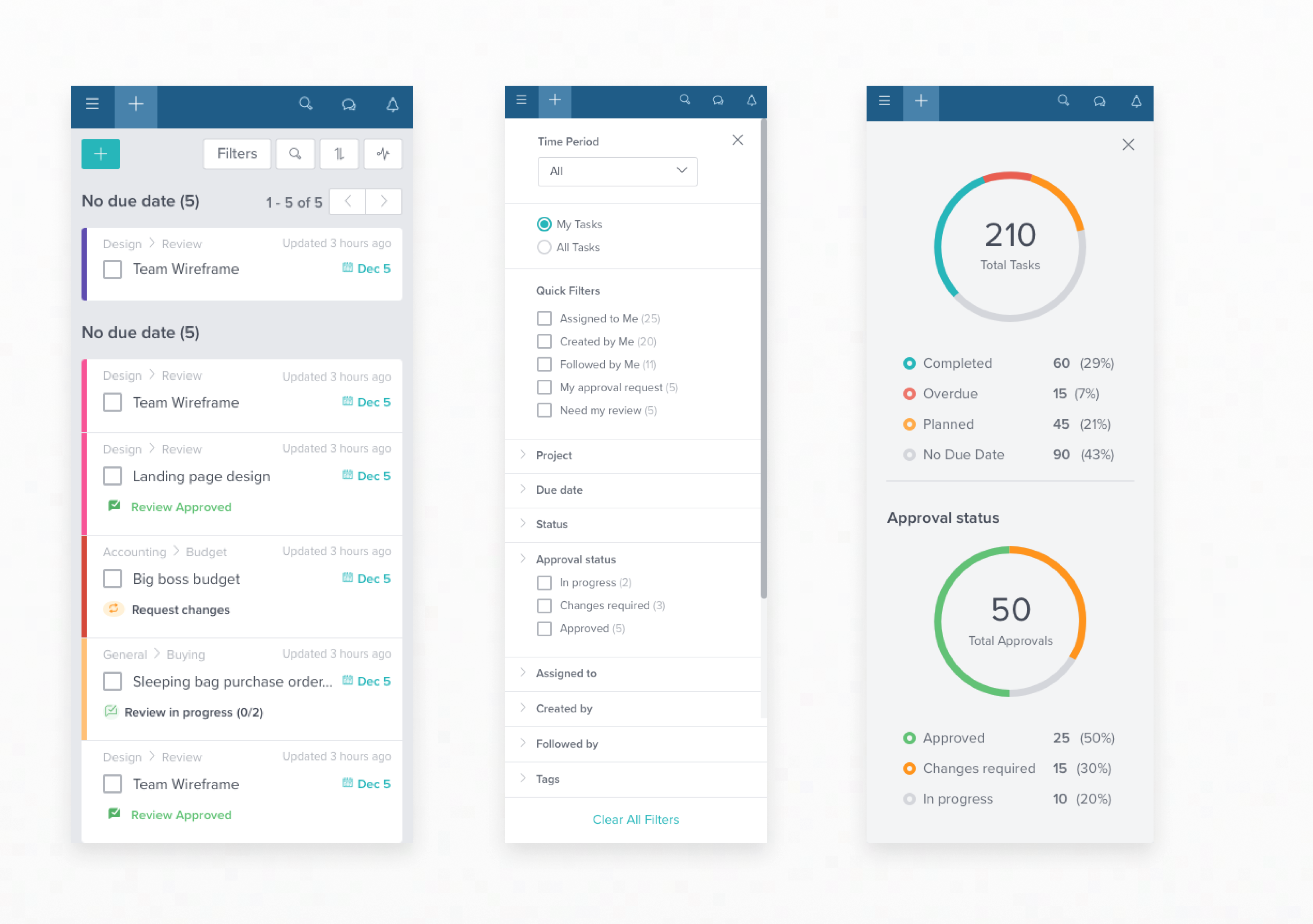
This solution had successfully launched to our private cloud users. Unfortunately, with the technical issues and the roadmap changes, we have to postpone this iteration for the public users.
Since the first version was released, we managed to increase 15 new licenses for the company revenue with 30% of active users using this feature.